Price Breakdown
Table of contents
The price breakdown component displays information about Afterpay instalments and handles a number of common scenarios.
The Info link at the end of the component will display a window containing more information about Afterpay for the user.
A configuration should be set on the Afterpay SDK in line with configuration data retrieved from the Afterpay API. This configuration can be cached and should be updated once per day.
A locale should also be set matching the region for which you need to display terms and conditions. This also affects how currencies are localised as well as what branding is displayed. For instance, usage of the en_GB locale will display Clearpay branding.
do {
  let configuration = try Configuration(
    minimumAmount: response.minimumAmount?.amount,
    maximumAmount: response.maximumAmount.amount,
    currencyCode: response.maximumAmount.currency,
    locale: Locale(identifier: "en_US")
  )

  Afterpay.setConfiguration(configuration)
} catch {
  // Something went wrong
}
A total payment amount (represented as a Swift Decimal) must be programatically set on the component to display Afterpay instalment information.
// A zero here will display the generic 'pay with afterpay' messaging
let totalAmount = Decimal(string: price) ?? .zero

let priceBreakdownView = PriceBreakdownView()
priceBreakdownView.totalAmount = totalAmount
After setting the total amount the matching breakdown string for the set Afterpay configuration will be displayed.
Intro Text
Setting introText is optional, defaults to or and must be of type AfterpayIntroText.
Can be any of or, orTitle, pay, payTitle, make, makeTitle, payIn, payInTitle, in, inTitle or empty (no intro text). Intro text will be rendered lowercase unless using an option suffixed with Title in which case title case will be rendered.
let priceBreakdownView = PriceBreakdownView()
priceBreakdownView.introText = AfterpayIntroText.makeTitle
Given the above, the price breakdown text will be rendered Make 4 interest-free payments of $##.## with
Optional Text
Setting showInterestFreeText and / or showWithText is optional and is of type Bool.
Both default to true. This will show the text pay in 4 interest-free payments of $#.## with. Setting showInterestFreeText to false will remove “interest-free” from the sentence. Setting showWithText to false will remove the word “with” from the sentence.
let priceBreakdownView = PriceBreakdownView()
priceBreakdownView.showInterestFreeText = false
Given the above, the price breakdown text will be rendered or 4 payments of $##.## with
Logo Type
Setting logoType is optional, will default to .badge and must be of type LogoType.
Can be one of .badge, .lockup or .compactBadge. When setting color scheme on logo type of .lockup, only the foreground color will be applied. (See example)
let priceBreakdownView = PriceBreakdownView()
priceBreakdownView.logoType = .lockup
priceBreakdownView.colorScheme = .dynamic(lightPalette: .blackOnWhite, darkPalette: .whiteOnBlack)
Given the above, the price breakdown will contain the lockup logo and will be colored black when the theme is white and white when the theme is dark.
More Info Options
Setting moreInfoOptions is optional and of type AfterpayMoreInfoOptions. This struct has two constructors. The first takes a two parameters:
modalId: an optionalstringthat is the filename of a modal hosted on Afterpay static. If not set, the default modal for the locale will be used.modalLinkStyle: an optional value of typeModalLinkStyle. See Modal Link Style Options for more details.
The second takes three parameters:
modalTheme: an enum of typeAfterpayModalThemewith the following options:mint(default) andwhite.isCbtEnabled: an optionalbooleanto indicate if the modal should show the Cross Border Trade details in the modal. Defaults tofalsemodalLinkStyle: an optional value of typeModalLinkStyle. See Modal Link Style Options for more details.
Note Not all combinations of Locales and CBT are available.
let priceBreakdownView = PriceBreakdownView()
priceBreakdownView.moreInfoOptions = MoreInfoOptions(modalTheme: .white)
Given the above, when clicking the more info “link”, the modal that opens will be white in the current locale as set in configuration.
Modal Link Style Options
A value that can be set on moreInfoOptions either when initialised or as a setter. Setting this is optional and is of type ModalLinkStyle.
Available values are circledInfoIcon, moreInfoText, learnMoreText circledQuestionIcon circledLogo custom none. circledInfoIcon is the default & none will remove the link all together.
When using custom an NSMutableAttributedString must be passed in (see second example below).
let priceBreakdownView = PriceBreakdownView()
priceBreakdownView.moreInfoOptions = MoreInfoOptions(modalLinkStyle: .circledQuestionIcon)
Given the above, the price breakdown modal link will be a circle containing a question mark.
let priceBreakdownView = PriceBreakdownView()
let customString = NSMutableAttributedString(string: "Click Here")
priceBreakdownView.moreInfoOptions = MoreInfoOptions(modalLinkStyle: .custom(customString))
Given the above, the price breakdown modal link will be “Click Here” text.
Examples
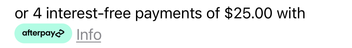
When the breakdown component is assigned a total amount that is valid for the merchant account, the component will display 4 instalment amounts.
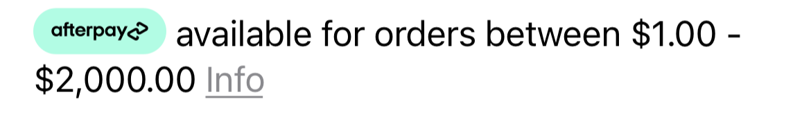
When the total amount is not within the minimum and maximum payment values for the merchant account, the component will display amounts that are available for Afterpay.
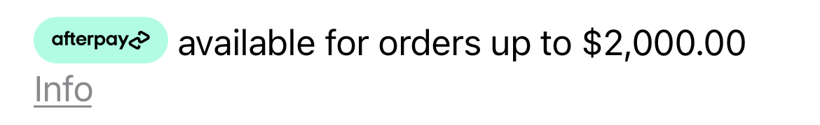
When no minimum amount is set and the total amount is greater than the maximum payment values for the merchant account, the component will show the maximum amount available for Afterpay.
When no payment amount has been set or the merchant account configuration has not been applied to the SDK, the component will default to a message stating Afterpay is available.

Accessibility and Dark mode
By default this component updates when the trait collection changes to update text and image size as well as colors to match. A components page in the Example app has been provided to demonstrate.